
Suppose you want to take a traditional tabular presentation of a baseball team’s schedule (for example, the 2004 Red Sox game log) and draw conclusions about specific aspects of the season or the season as a whole. How do you quickly answer questions like:
- How did the team perform in games started by Pedro Martinez? Compared to other starters?
- Did they play an unusual proportion of close games? How did they do in those games?
- Was there some kind of “shape” or pattern to their season?
- Was there some trend in the games they won or lost?
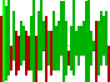
SportVis uses visualization to help people discover meaning in the massive amount of statistics generated during sporting events. A single baseball game generates a large amount of data. One game of two teams comprises nine innings, each with multiple plate appearances. Each plate appearance has a discrete outcome and can be described by a number of attributes. We can further separate the plate appearance into individual pitches. We can aggregate the data at many levels along this hierarchy and create interactive visual representations of these aggregations.
We focus on the season and game levels in this baseball version of SportVis. We provide two visualizations, which we call the baseline bar display and the player map. The user is always exploring data with respect to a particular team (the focus team). For example, when we reference the number of runs scored, we mean the runs scored by the current focus team.
Read more about baseball SportVis in the paper above and run the demo Java applet yourself (data from the 2004 season).
Learn more about SportVis here.