Figure 1-1 Module Control Panel
The five maps presented here use authentic data to illustrate the workings of IRIS Explorer. Each map deals with a specific issue, and the modules provide ways of altering or enhancing the data so as to make its significance clear, and perhaps to elicit correlations that might otherwise have gone unnoticed.
The maps are complete. You need only launch, or open, the map in the Map Editor, and then try varying the parameters as suggested in each example. Chapter 2 explains how you set about creating your own maps. Table 1-1 defines some of the terms you will encounter when you start IRIS Explorer.
explorer -map /usr/explorer/maps/mapname.map
The mapname.map is the name of the map you want to open, for example, chemistry.map;. The name of each map shown in this chapter is given in the introduction to the map.
IRIS Explorer starts up and the map appears in the Map Editor. All the modules are selected (highlighted in white), and you can move the entire map by dragging on the title-bar of a single module.
Click on the background of the Map Editor to deselect the modules in the map before you experiment with individual modules. The highlighting disappears.
Once IRIS Explorer is running, you can use the Module Librarian to open a map. Follow these steps.
You can also hold down the left mouse button, drag the map over to the Map Editor and release the button.
When you release the mouse button, the map appears, module by module, on the screen. The menu bar displays a number in angle brackets, for example, <5>, which tells you initially how many modules are in the map; the number decreases as modules appear on screen, indicating how many modules remain to be launched.
To quit IRIS Explorer, select Quit from the Admin menu in the Map Editor.
This example illustrates how you can use IRIS Explorer modules to process
an image. Please note that the Image Processing modules are not
provided with all implementations of IRIS Explorer. The
koreaContour
map takes an aerial image of a region of the Korean landscape, renders it in
3D, and overlays a contour map showing altitudes. The resulting image is
displayed on-screen. The map file is
/usr/explorer/maps/koreaContour.map.
To open the
koreaContour
map, displayed in
Figure
1-2, type
The seven modules are connected to one another by blue wires. The
modules on the left reads in the image file and altitude data,
and the module on the far right
displays the processed image. In between these are four modules that
manipulate the image data.
The seven modules in the map have the following functions:
Both the aerial image and the altitude data go through
DisplaceLat
(see
Figure
1-3), which displaces the image data so that topographical features
become 3D.
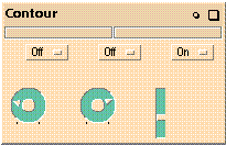
The output of
DisplaceLat<2>
passes into
Contour
(see
Figure
1-4), which creates a series of lines at varying heights above sea level
just as in a topographic map. The scale factor for
DisplaceLat<2>
should be greater than that for
DisplaceLat, to make the contour lines visible.
To set the relationship between scale factors, the Scale parameter output
port on
DisplaceLat
is wired to the Scale parameter input port on
DisplaceLat<2>.
The result is shown in
Render
(see
Figure
1-5). You can open the
Render
window by clicking on the
Maximize
button and rotate the object in the window.
For more information on using the
Render
menus to manipulate objects, see
Visualizing Data
in Chapter 3.
This example illustrates how to use IRIS Explorer modules to read in a
short program script describing a mathematical function and visualize the
data in the
Render
window. The mathematical function describes diffusive heat flow. It is a
finite difference
(footnote)
stencil for solving problems in parabolic differential heat conduction.
The form of the equation in this example is dimensionless; it serves as a
normalized thermal model. A map using a specific form of such an equation
with actual data can be used, for example, to test the conductivity of steel.
To open the
heat-flux
map (see
Figure
1-6), type
The map contains six modules, which have these functions:
A
lattice
is an IRIS Explorer data type, which is used to store an ordered array of
data. For more information, see
Understanding IRIS Explorer Data Types
in Chapter 2.
LatFunction
reads in a short program written in the Shape language, which is described in
detail in
"Chapter 10"of the
IRIS Explorer Module Writer's Guide. It is a
C-like language that has capabilities for operating on whole lattices with a
single statement. The program is saved in a file called
heat-flux
in
/usr/explorer/maps
and can be run as often you choose.
The data passes from
LatFunction
to
Displacelat, which displaces the 2D data into a 3D array to show the
heat source as a peak and the heat sink as a trough. You can change the
degree to which the peaks project from the surface by turning the dial on
Displacelat. This causes the data to be displaced out of the plane
to a greater or lesser degree.
GenerateColormap
colormaps the heat-flux data according to temperature value. You can change
the colors associated with each temperature value by using the option menus
on the control panel. Refer to
Creating Colormaps
in Chapter 3 for more information.
LatToGeom
uses the heat-flux and colormap data (which are both IRIS Explorer lattices)
to create geometry for display in
Render
(see
Figure
1-7).
Render
can only display geometry, and all lattice data must be converted first.
Once the data is displayed in
Render, you can change the background color of the window by
selecting
Edit Background Color
from the Viewing menu. When the Background Color Picker appears:
This example illustrates how you can use IRIS Explorer modules to
construct a 3D model of a complex organic molecule and then calculate the
optimal radius and likely path for a probe atom investigating the target
molecule.
To open the
chemistry
map (see
Figure
1-8), type:
The map takes configuration data for a NutraSweet
molecule and creates a ball-and stick representation of it and a dot surface
that shows the region that is accessible by a probe atom.
The map contains seven modules:
The molecular configuration data is read in by
ReadPDB. The input file is in the Brookhaven Protein DataBase (PDB)
format, a commonly used format for saving descriptions of proteins, including
atom positions and properties, and bond locations.
BallStick
(see
Figure
1-9) receives the data in pyramid form and generates sphere-and-cylinder
geometry. (The pyramid is an IRIS Explorer data type.) The radius of each
sphere is calculated according to the van der Waals' radius of the
corresponding atom.
The molecule data also passes into
AtomicSurf
(see
Figure
1-10). It uses the van der Waals' radius of each atom and adds a solvent
probe radius to it. The surface points in this
solvation layer
represent the positions in which a solvent probe would be in contact with the
target molecule.
It is best to use lower densities for large molecules, otherwise the
visualization becomes very cluttered. A density of about 10
dots/Angstrom2
works well for molecules which have sizes comparable to that of NutraSweet.
GenerateColormap
creates a default colormap for the molecule based on atomic number. The
domain is set at a minimum of 0 and a maximum of 16 to accommodate the atoms,
which are hydrogen, carbon, oxygen, and nitrogen.
It also colormaps the dots in the solvent-accessible surface according to
the parent atom of each dot. This provides you with information about which
atoms a given probe will touch as it traverse the surface of the molecule.
You can use the capacities of
Render
to look at the NutraSweet molecule in great detail (see
Figure
1-11). You can:
For more information on using
Render, read
Visualizing Data
in Chapter 3.
You can use
FileList
to select another chemistry molecule to examine.
This example illustrates how you can use IRIS Explorer modules to
visualize atmospheric data. Intense storms can produce tornadoes, high winds,
and hail, and it is possible to simulate these storms by integrating a set of
mathematical flow equations. These equations can, for example, predict values
for the wind speed and direction, air temperature, humidity, pressure, and
water content every 5 to 10 seconds on a lattice of grid points 500 to 1000
meters apart.
The data in the example map is taken from a simulation of a single severe
storm made by the storm group at the University of Illinois
(footnote)
. The map shows an isosurface of rain density and a volume rendering of air
buoyancy. An isosurface is a surface which passes through all points in a 3-D
dataset where the data has a particular value. The data is in the form of a
uniform lattice.
To open the
volume
map (see
Figure
1-12), type:
The map contains eight modules:
For volume rendering techniques to display the volume as shown in this
map, you require alpha blending hardware. Some workstations do not have this
hardware, but they can display the volume adequately if the Splat type on
VolumeToGeom
is set to
Point
(see
Experimenting with the Volume Map
below).
This map uses both surface rendering (the isosurface) and volume rendering
(the haze) in one visualization to show the relationship between a number of
variables which have been calculated in 3-D space during the modelling of
the evolution of the storm.
IsosurfaceLat
(see
Figure
1-13) calculates an isosurface from the density data and outputs it as
geometry. The threshold value is the density value for which an isosurface is
created.
Rendering splats can may take a long time. You can set and adjust an error
tolerance to get a balance between rendering time and splat quality.
ReadLat<3>
reads the colormap settings for the volume rendering of the water buoyancy
data into
GenerateColormap. The current setting for the colormap shows buoyant
air, containing little water, in red and the saturated air in blue.
Once the data is in
Render, you can analyze it in detail.
Figure
1-14
displays the reflectivity from the storm
(footnote)
. The blue-white surface encloses the area containing most of the large
drops and hail. Several light sources illuminate the surface. You can see the
overhang, observed by weather radar in many severe storms, at mid-level where
the reflectivity surface comes out toward the viewer.
Above the storm, there is a region of many colors volumetrically rendered
from the buoyancy, a quantity used in the equations for vertical velocity. It
represents the instantaneous effects of temperature, moisture, and water
mixed with ice on the velocity acceleration, and is large at and above the
top of the storm.
A wavy appearance is evident, indicating the presence of strong gravity
waves. Yellow/green indicates relatively high buoyancy, blue indicates
relatively low buoyancy. The effect is roughly similar to throwing a rock
into a pond, but here it is the storm growing into the upper atmosphere.
You can change the opacity values on the colormap to affect the look of
the volume rendering (see Chapter 3,
Creating Colormaps).
This example illustrates how you can use IRIS Explorer modules to study
the dynamics of air flow over the nose of an aeroplane. The
cfd
map shows variations in air density surrounding the surface of the aeroplane.
The map generates an air flow field around the plane, extracts 2D slices
of the volume, and colormaps them by density value, thus providing a means of
examining different areas of the field.
The CFD group at Silicon Graphics created the plane from a model aeroplane
by a digitized 3D scanning process, and the air flow data was generated from
NASA's fluid dynamics program,
ARC3D
(footnote)
.
To open the
cfd
map (see
Figure
1-17), type:
The map contains nine modules:
As you vary the slice numbers, you get information about air densities at
the plane surface and in its vicinity. High air densities occur at the nose
when there is a massive deceleration of fluid. As the air flows away from the
leading edge and accelerates over the wing, the density drops.
GenerateColormap
colormaps the grid produced by
OrthoSlice
according to its air density values. It is a scalar field, with one value at
every point. The domain in
GenerateColormap
is set to a density minimum of about 0.7 and maximum of 1.1. This colormap is
also used to color the probe surface according to air density values.
PyrToGeom and LatToGeom convert pyramid and lattice
data respectively to geometry which can be displayed by Render.
Once the data is displayed in Render (see Figure 1-18), you can enhance the visualized data by
using the Render menus. For example, click on the background of
the Render window to bring up the Render pop-up
menu. Select the Draw Style option, and then select
wireframe from the cascading menu. To return all the surfaces
to their original state, bring up the menu again and select the as
is option.
Opening the Image Map
explorer -map koreaContour.map
Figure 1-2 Processing an Image
Experimenting with the Image Map
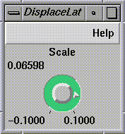
Figure 1-3 DisplaceLat Control Panel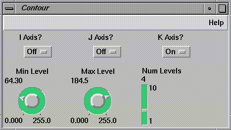
Figure 1-4 Contour Control Panel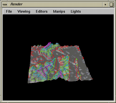
Figure 1-5 The Contour Map in Render
Numerical Mathematics
Opening the Heat-flux Map
explorer -map heat-flux.map
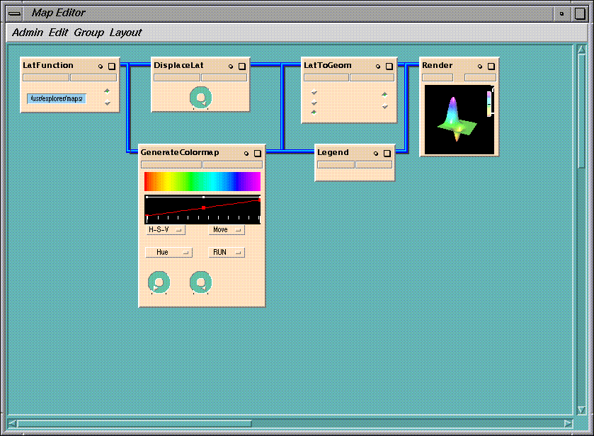
Figure 1-6 Map for a Heat Flux
Experimenting with the Heat-flux Map
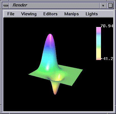
Figure 1-7 Visualization of the Flux Peaks
Molecular Chemistry
Opening the Chemistry Map
explorer -map chemistry.map
Figure 1-8 Visualizing a NutraSweet Molecule
Experimenting with the Chemistry Map
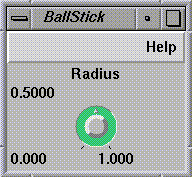
Figure 1-9 BallStick Control Panel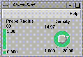
Figure 1-10 AtomicSurf Control Panel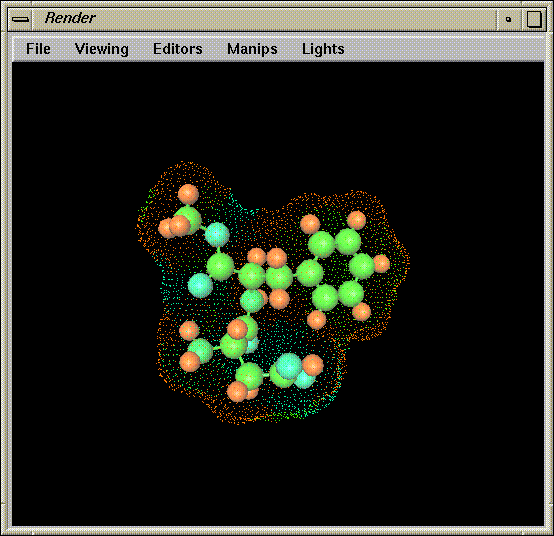
Figure 1-11 The Molecule in Render
Atmospheric Physics
Opening the Volume Map
explorer -map volume.map
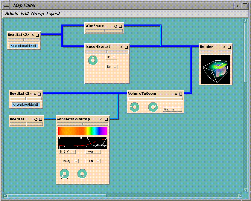
Figure 1-12 Simulating an Evolving Storm
Experimenting with the Volume Map
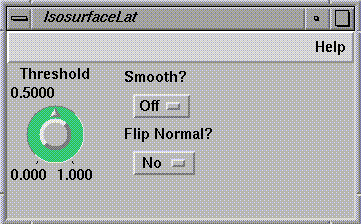
Figure 1-13 IsosurfaceLat Control Panel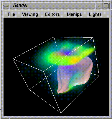
Figure 1-14 Storm Data in Render
Computational Fluid Dynamics
Opening the Cfd Map
explorer -map cfd.map
Experimenting with the Cfd Map
OrthoSlice (see Figure 1-15) operates on
the air density data to produce a curvilinear grid depicting the
density field around the plane. The slice number is 3 and this index
increases in a direction normal to the plane's surface. For J =
1, the grid actually lies along the surface of the plane.
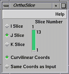
Figure 1-15 OrthoSlice Control Panel
ProbeLat and IsosurfaceLat complement each other.
IsosurfaceLat generates an isosurface from the air density
data. This tells you how all the air of a given density is distributed
around the plane. You can change the threshold (the value at which
the isosurface is calculated) by turning the dial on the control
panel.
ProbeLat (see Figure 1-16) probes the
curvilinear flow field along an arbitrary axis. The slice shows all
density values in that region, colormapped by value.
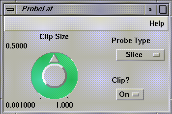
Figure 1-16 ProbeLat Control Panel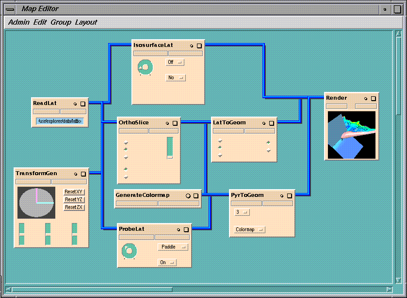
Figure 1-17 Different Levels of Air Density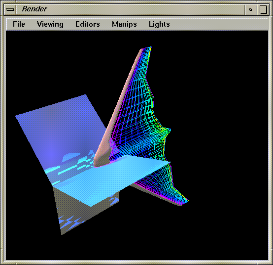
Figure 1-18 The Rendered Flow Field
Last modified: Mon Oct 13 11:04:05 1997
[ Documentation Home ]